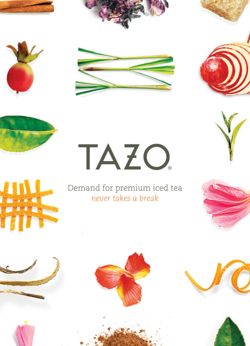
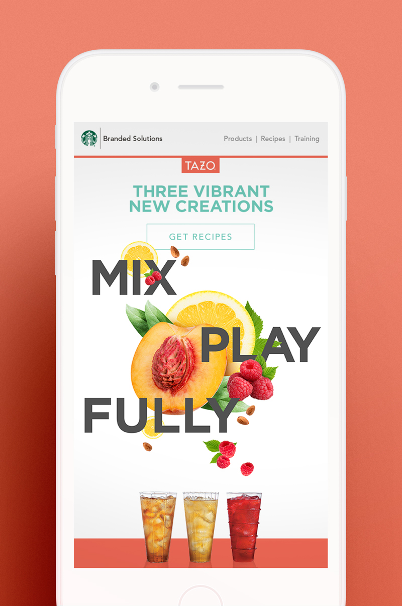
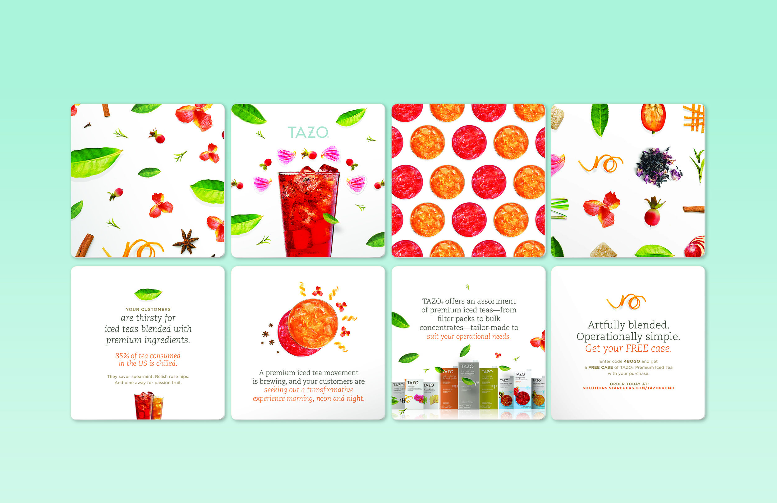
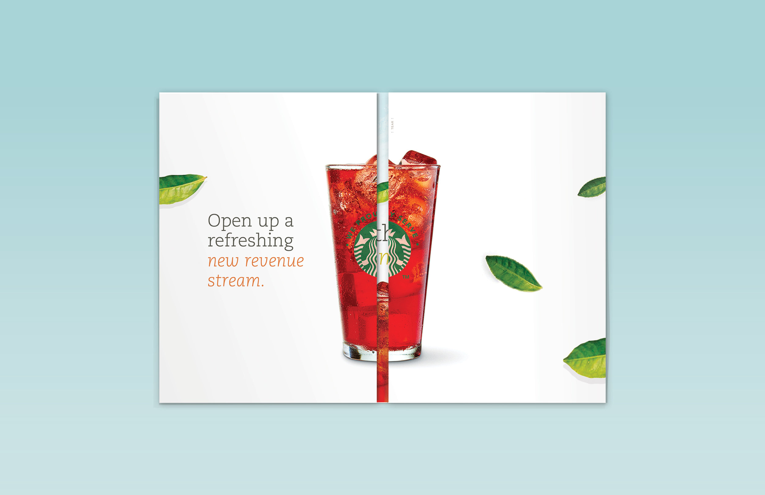
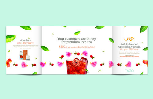
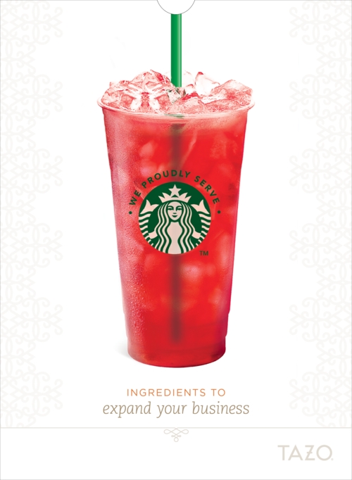
The Tazo tea brand is known for its simple yet sophisticated design. When Pakko’s team won the Starbucks SBS account, him and his team of designers were tasked with creating a visual language that would appeal both aesthetically and taste-wise without being too overwhelming or complicated – because as the old adage says, “less can be more.”
The result was something truly beautiful: bold colors paired perfectly together against clean white backgrounds while still keeping things lighthearted through earthy and natural graphics which made them easygoing despite the complexity of each tea flavor.
